WorkshopOS is software for car repair shops. Today a single repair gets
diagnosed by a mechanic, scribbled on paper, texted to whoever orders
the parts, then typed into a spreadsheet days later. Three places, three
chances to lose it. I designed one system where all of it hangs off the
job itself.
Sole designer. Research, UX, UI, and the working prototype
Type
Self-directed. Three interviews with workshop owners shaped it
Status
Working interactive prototype. Not yet usability-tested
Focus
How the information is structured, and who gets to see what
01 The problem
These shops weren't short of software. They were short of one place
to put things.
A repair starts as a mechanic's diagnosis. It becomes a handwritten note.
Then a WhatsApp message to whoever orders the parts. Days later somebody
types it into a spreadsheet. By then the spreadsheet and the note disagree,
and nobody is quite sure which one is right.
How I looked into it
I sat down with three independent workshop owners, twenty to thirty
minutes each. I never asked them about software. Ask people what features
they want and you get a feature list. I wanted to know how the
work actually moves through a shop.
Walk me through what happens when a customer brings a car in.
What happens after the mechanic finds a problem?
How do you know which parts need to be ordered?
How does the information eventually become an invoice?
What I found
Owner 1
Keeping everyone updated
They ran the shop on spreadsheets, paper, phone calls and texts. They
never once called it a software problem. What they described was having
to keep everyone updated, all day long. Writing things down was never
the hard part. Keeping every copy of it in agreement was.
Owner 2
The parts bottleneck
Diagnosis goes to the manager. Manager checks the shelf. Shelf check
goes to a supplier. Somebody places the order. Meanwhile the mechanic
stands around. Five hand-offs, and each one can go wrong: the wrong
part, the same part ordered twice, or nobody remembering which car it
was for.
Owner 3 · proved me wrong
Already organised
This one proved me wrong, which was the most useful thing that happened.
I had assumed every workshop was drowning in spreadsheets. Theirs worked
fine. The systems just didn't talk to each other.
That third conversation changed the brief. I stopped designing a replacement
for spreadsheets and started designing something to cut the number of times
a job has to change hands.
02 My thinking
Everything hangs off whatever you put at the centre.
If hand-offs are the problem, the system has to be built around the thing
being handed off. I had three candidates. This is the one decision that
shapes every screen after it, so it was worth slowing down for.
Considered
Customer-centred
Fine for a contact list. But a customer isn't a piece of work, and the floor doesn't run on customers.
Considered
Vehicle-centred
Good for service history. Misses everything happening around the car: who is on it, what it costs, whether it is stuck.
Chosen
Work Order-centred
One customer owns several cars. One car comes back many times. The job is the thing happening right now, which is what everyone is actually asking about.
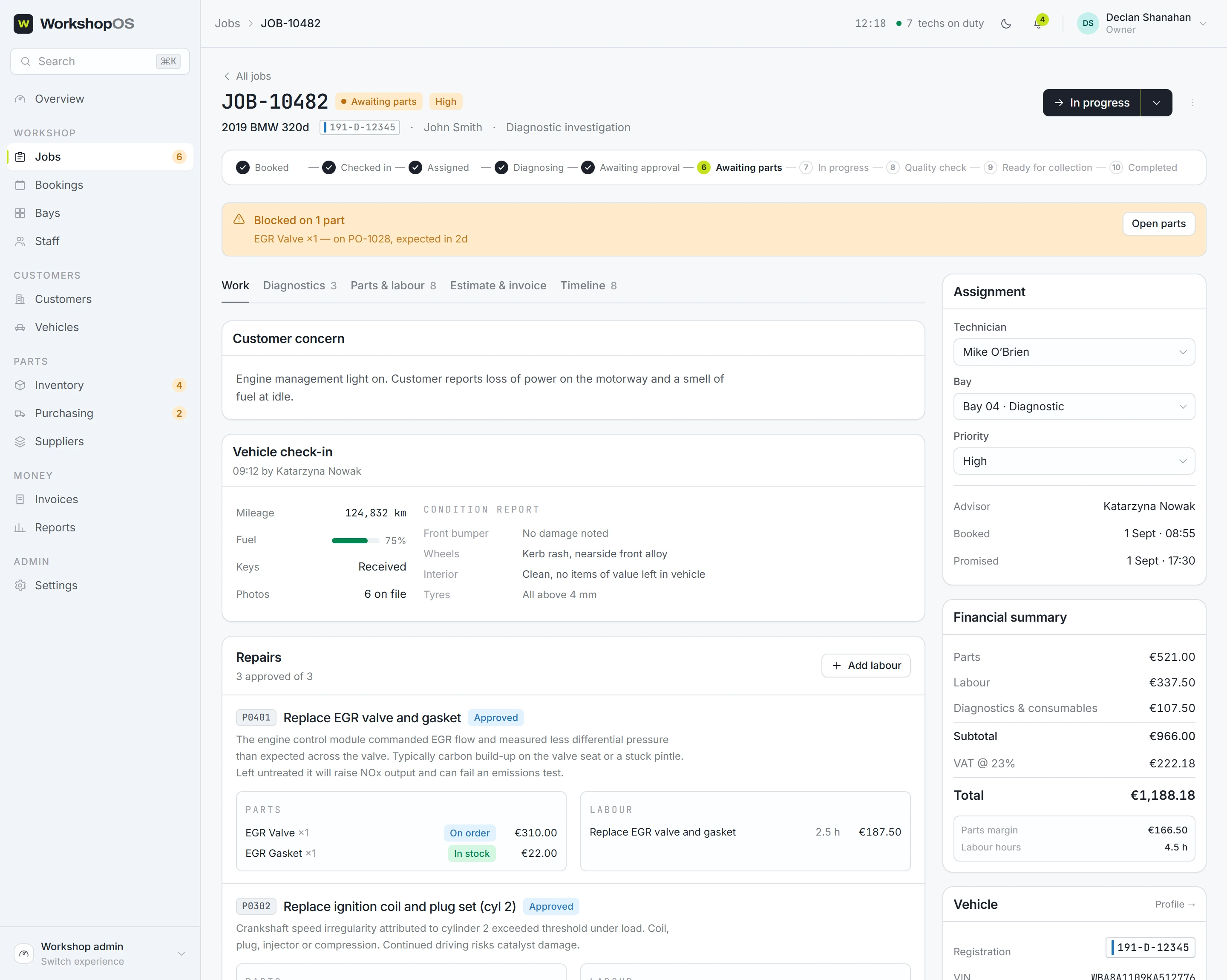
So the job became the spine. Parts attach to it. Hours attach to it. The
diagnosis attaches to it. When it is time to invoice, the invoice is already
sitting there, built from what everyone did, instead of somebody retyping it
off a note.
The decision I reversed
My first version made the admin dashboard the main event, with the
mechanic's workflow tucked inside it as a section. That was wrong, and why
it was wrong turned out to be the most useful thing I learned on this
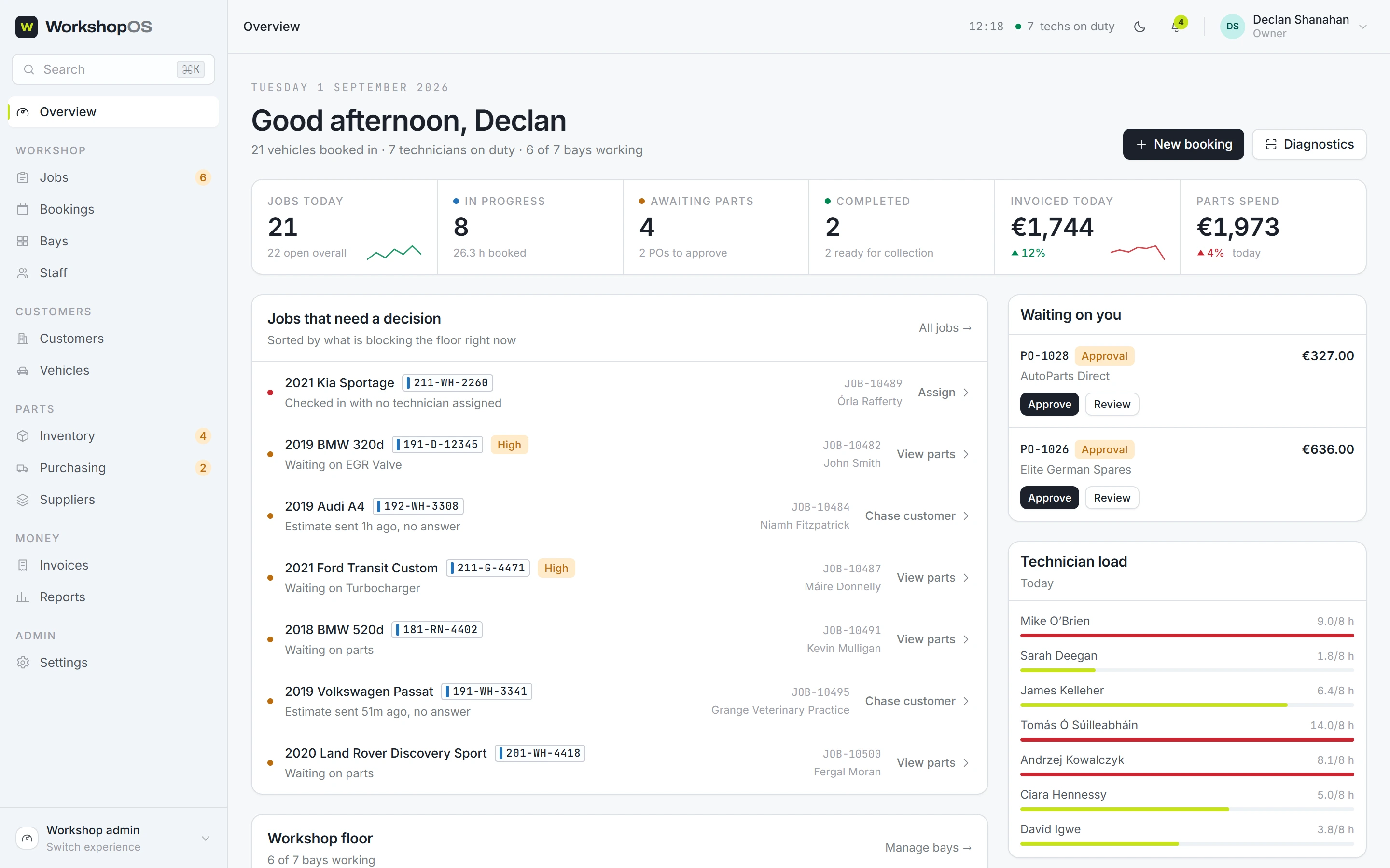
project. A manager opens the app asking "what's happening across the
whole shop?" A mechanic opens it asking "what's happening
with this car?" No single screen can answer both of those first.
So I rebuilt it as a separate experience per role, all running on the same
data underneath. That is the decision that produced the permissions model
further down this page.
app.workshopos.io
Across the workshop
The manager's question, answered first thing in the morning. The list leads with whatever is blocking a bay.
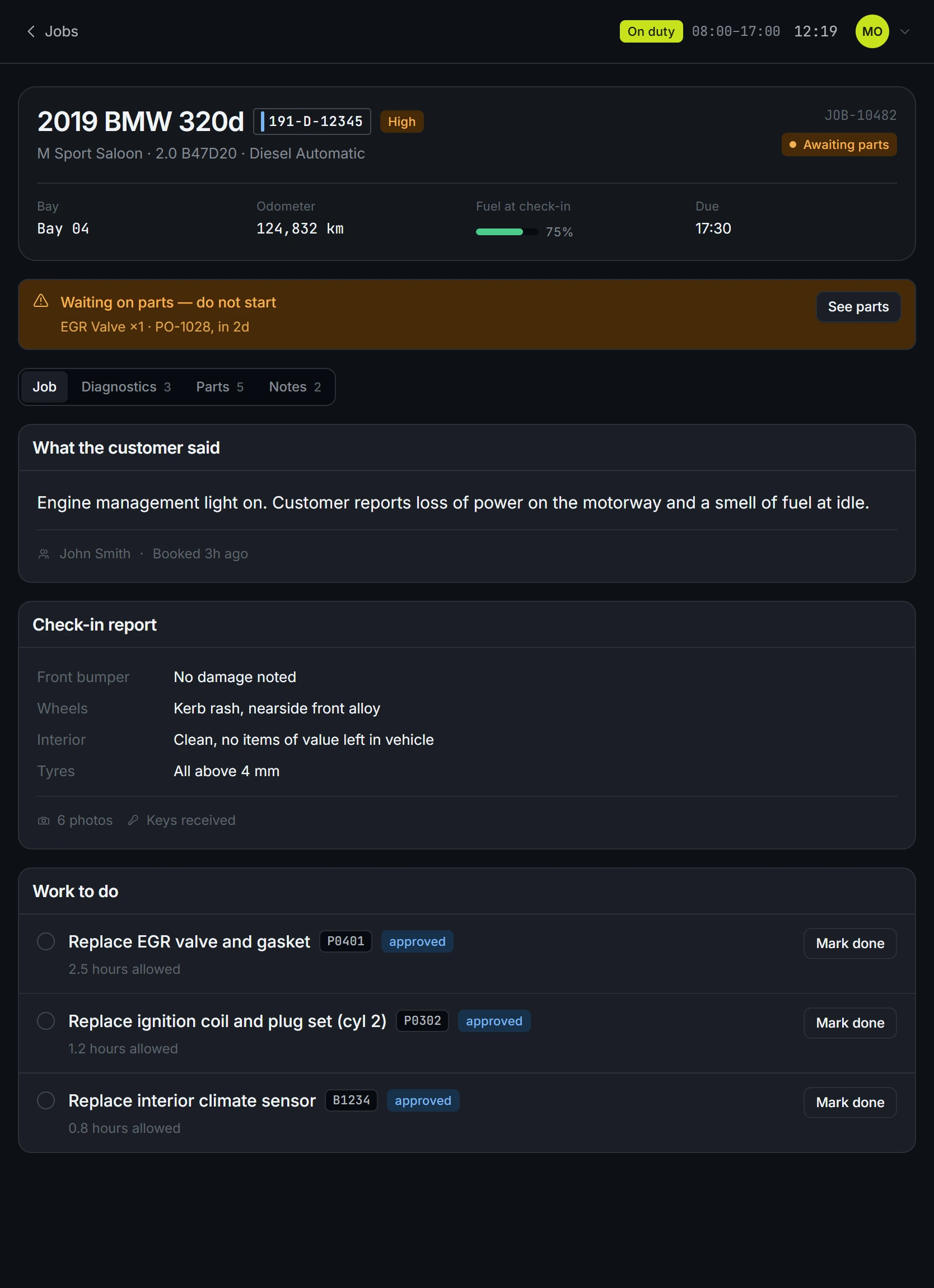
This vehicle
The mechanic's question, on a tablet next to the car.
Principle
A mechanic should be working on the car, not running the business.
So their screen is stripped back on purpose. Jobs, diagnostics, repair
steps, parts requests, notes, photos, status. That is the whole thing. No
revenue, no staff rotas, no payroll, no settings. Those are not hidden for
security reasons. They are absent because they belong to somebody else's
job, and every extra row is one more thing to scroll past while you are
holding a torch in your other hand.
It answers five questions and then it stops:
What vehicle am I on?
What's wrong?
What needs repairing?
What parts do I need?
What's next?
03 The business
Every time a job changes hands, it costs the shop money.
Who it is for: independent mechanics and small multi-bay garages currently
holding together a diagnostic tool, a pad of paper, a phone, a spreadsheet
and some accounting software with nothing but memory. The pitch is
deliberately narrow. Connecting those five things is the entire product,
because the gaps between them are where a shop quietly loses money.
It also has to work for the person using it, not only the person buying it.
The owner gets oversight. The mechanic gets speed. Plenty of shop software
gets sold to an owner and then quietly resented by the floor, and I did not
want to design that.
One thing I held back on: AI. I could have put it on the front of the box.
But what this actually does is connect steps that were already there, and
calling that AI would have made the pitch trendier and the promise vaguer.
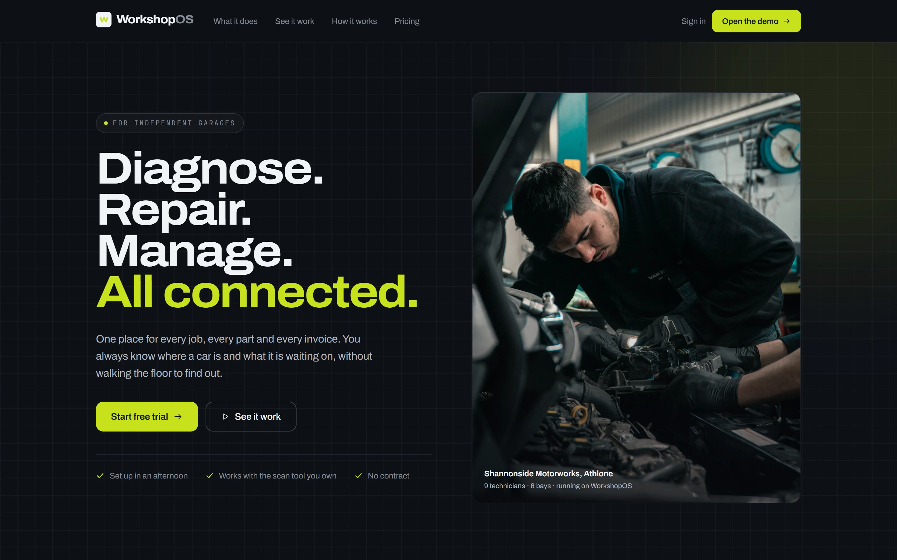
workshopos.io
Positioning
The headline uses the words a mechanic would use. Feature detail waits
until further down the page, once the plain-English promise has landed.
04 The users
Seven roles, because a garage is not one job.
The interface changes depending on who signs in. This is not a personas
slide bolted on at the end. It comes straight out of the two questions I
kept hearing: what is happening across the shop, and what is happening with
this car.
Owner
Money, people, throughput. Everything.
Workshop Manager
The floor: jobs, bays, technicians, parts.
Service Advisor
The customer conversation and the estimate.
Parts Manager
Stock, suppliers, purchase orders, goods in.
Technician
Assigned jobs, diagnostics, parts requests, notes.
Accountant
Invoicing, payments, VAT, financial reporting.
Receptionist
Bookings, check-in, keys, phones.
Customer
Where is my car, what will it cost, approve it, pay.
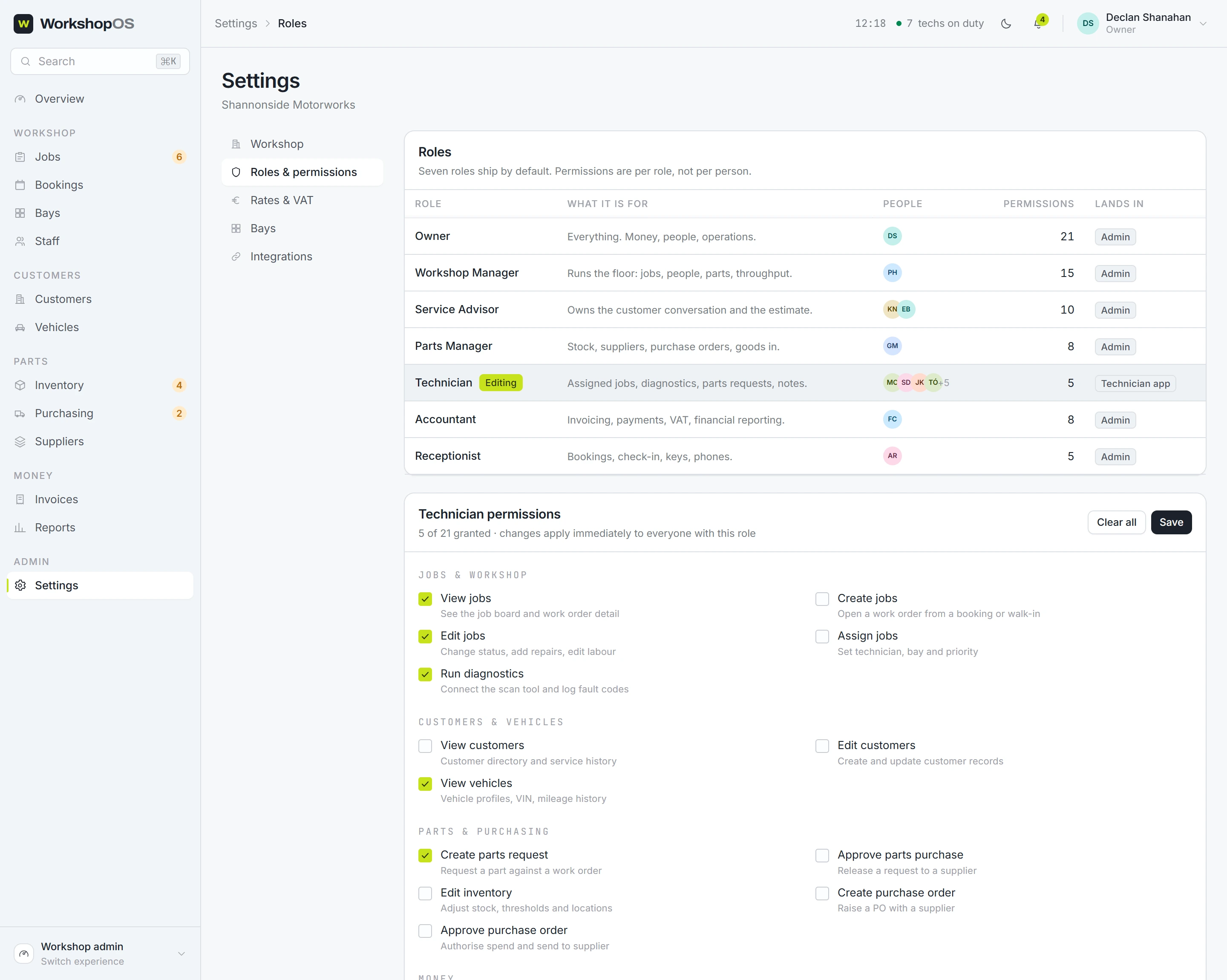
app.workshopos.io/settings/roles
Roles and permissions
Twenty-one permissions, set per role rather than hardcoded per person.
Untick one and the navigation changes for everyone in that role straight
away, no reload. It is wired up rather than drawn.
05 The constraints
The biggest constraint was hardware I could not build.
A real version of this plugs into a diagnostic scanner, speaks the car's own
protocols, and pulls manufacturer data. I could not build any of that, and
chasing it would have eaten the time I needed for the actual design
question. So the scan is simulated. The flow runs end to end, and the
product says plainly that no physical scanner is involved.
I was testing the workflow and the way the information is organised. The car
electronics were somebody else's problem.
Scan
Fault code
Repair recommendation
Required part
Inventory
Purchase request
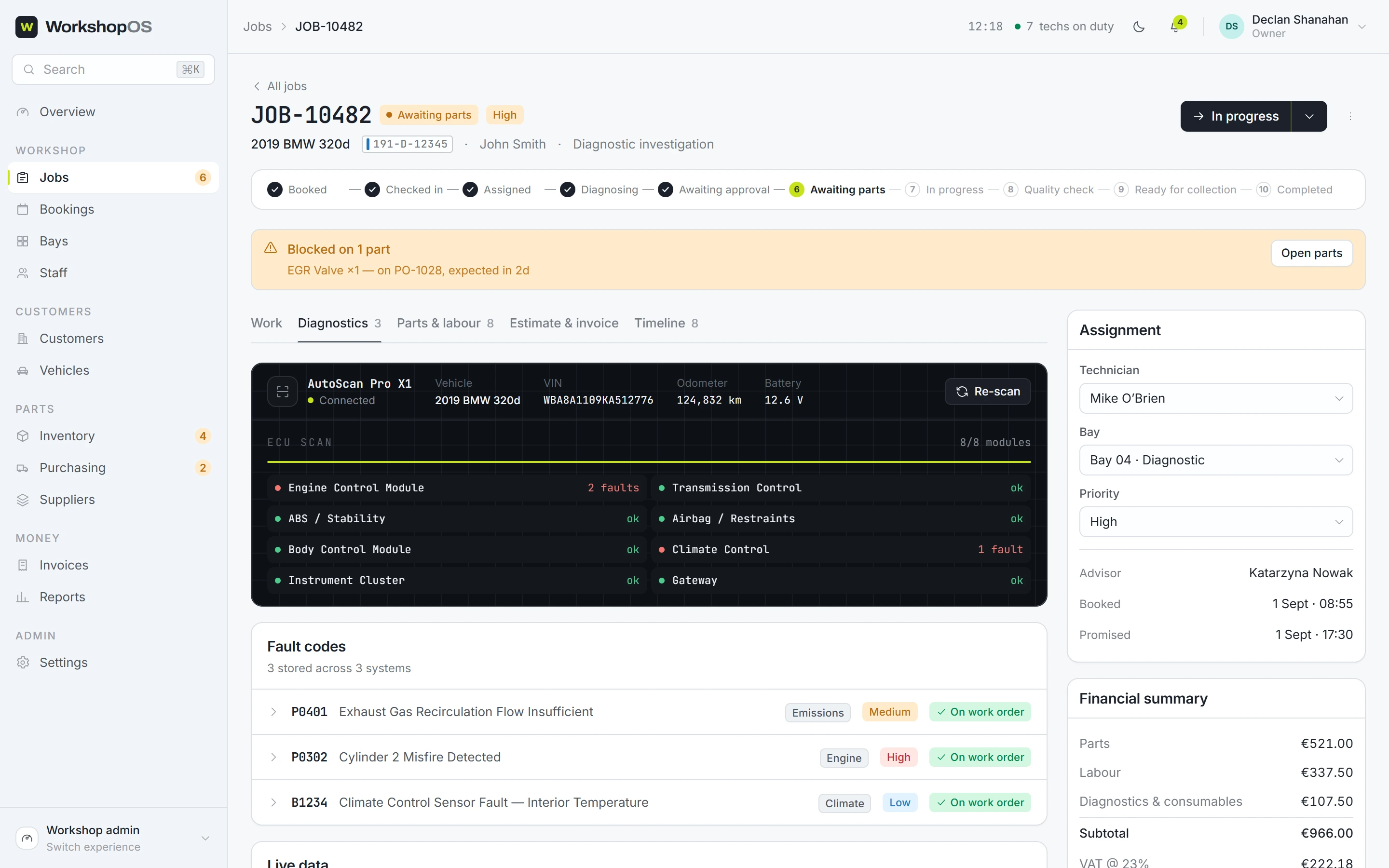
app.workshopos.io/jobs/10482?tab=diagnostics
Simulated scan
I styled the console like a piece of workshop equipment rather than a web
dashboard. Mono type, dark field, a scan line that sweeps. It stands in
for a physical tool, so it should look like one.
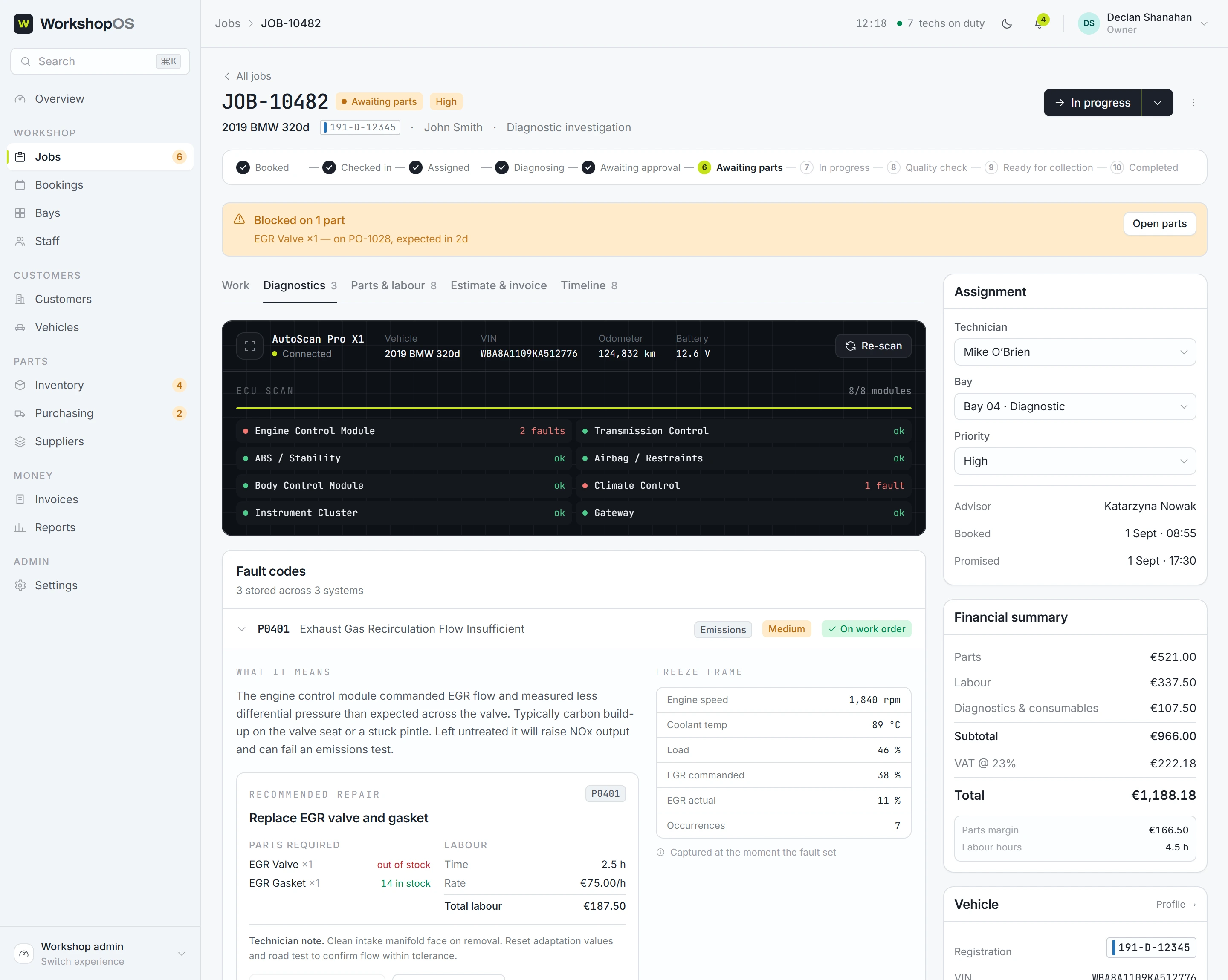
app.workshopos.io/jobs/10482?tab=diagnostics
Fault code becomes priced repair
This is the hinge the whole product turns on. The fault code already knows
its repair. The repair already knows its parts. Those parts get checked
against the shelf before anyone has typed a thing.
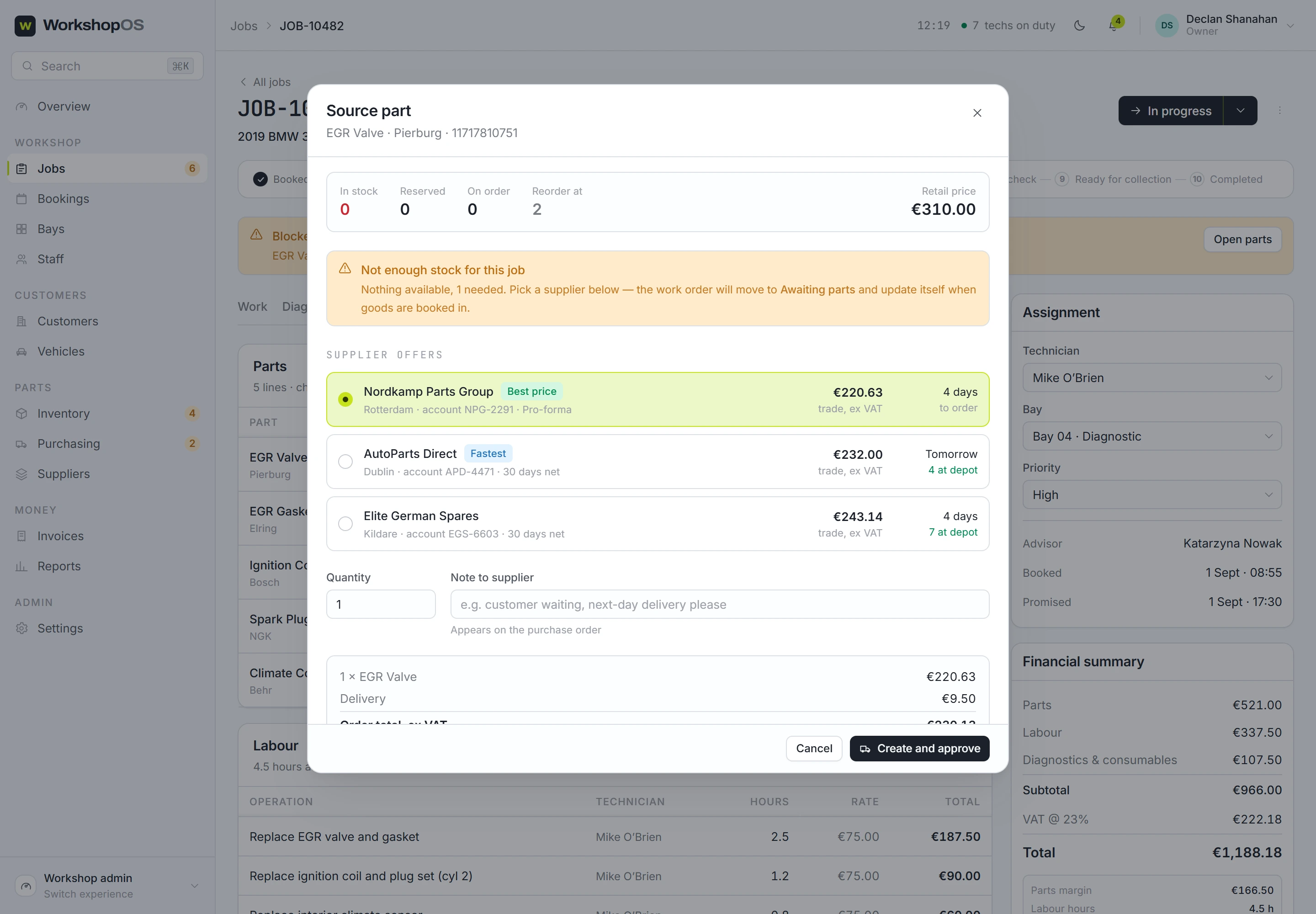
app.workshopos.io/jobs/10482
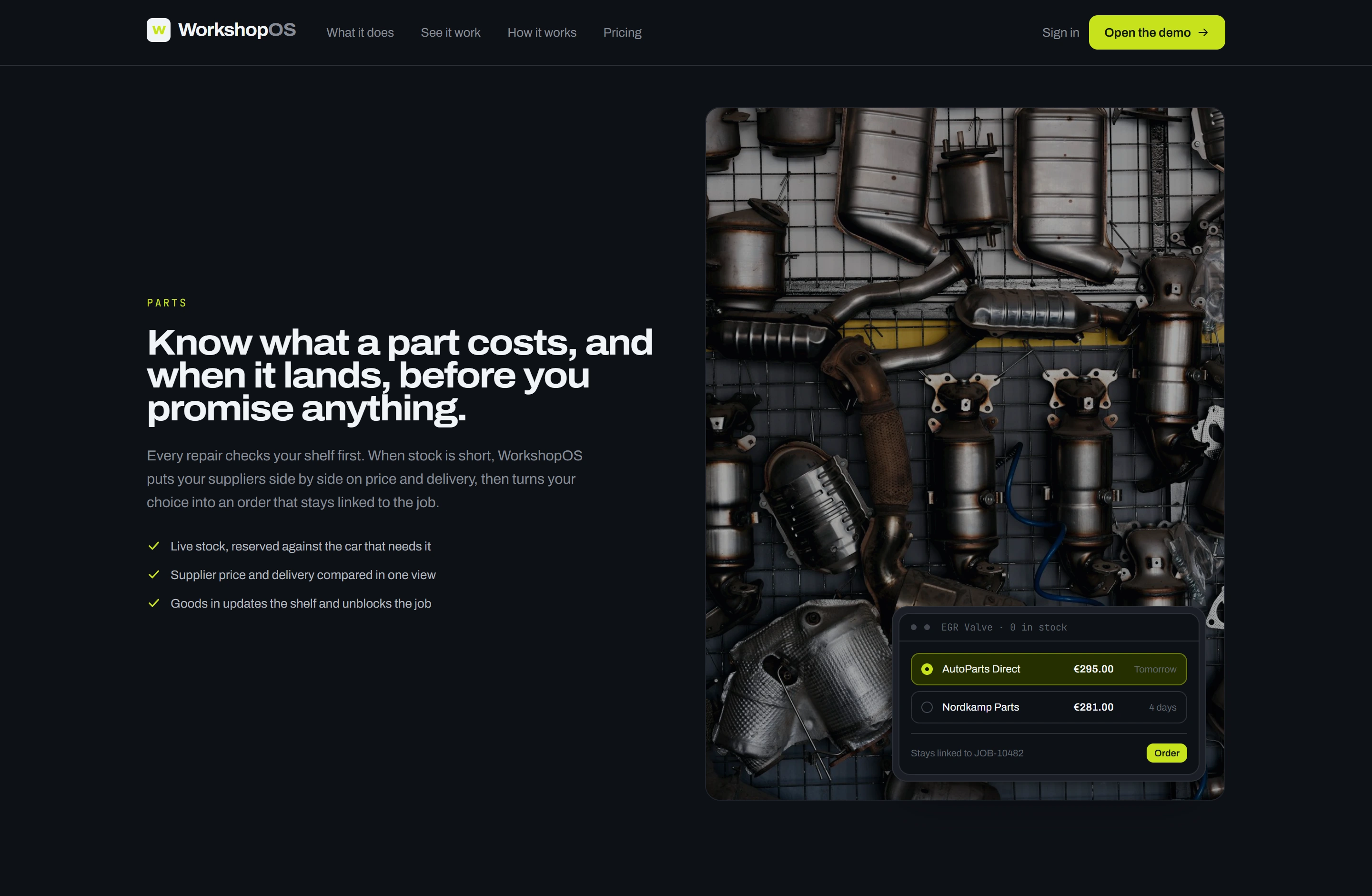
Supplier comparison
"Out of stock" turns into a choice with three prices and three delivery dates on it. No ringing round.
app.workshopos.io/purchasing/PO-1028
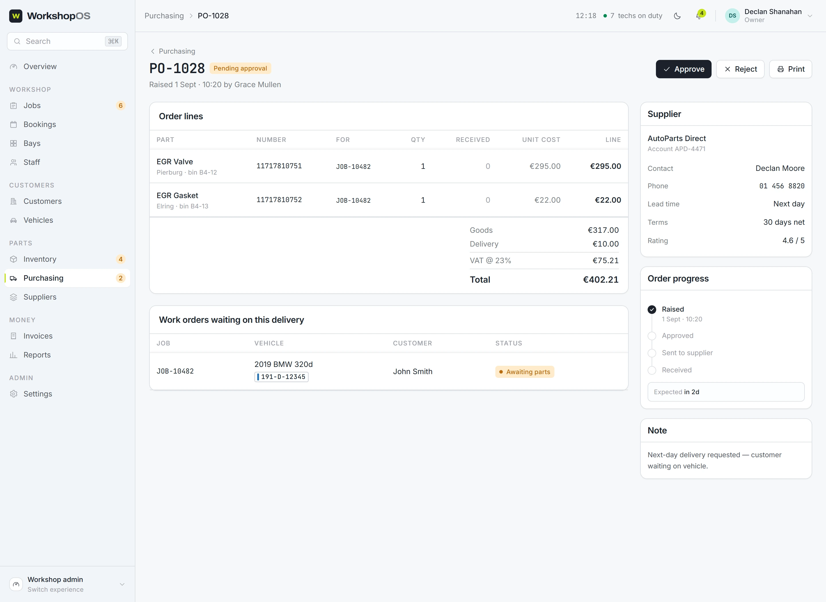
Purchase order
It still carries the job number it came from, so booking the part in unblocks that exact car.
app.workshopos.io/parts
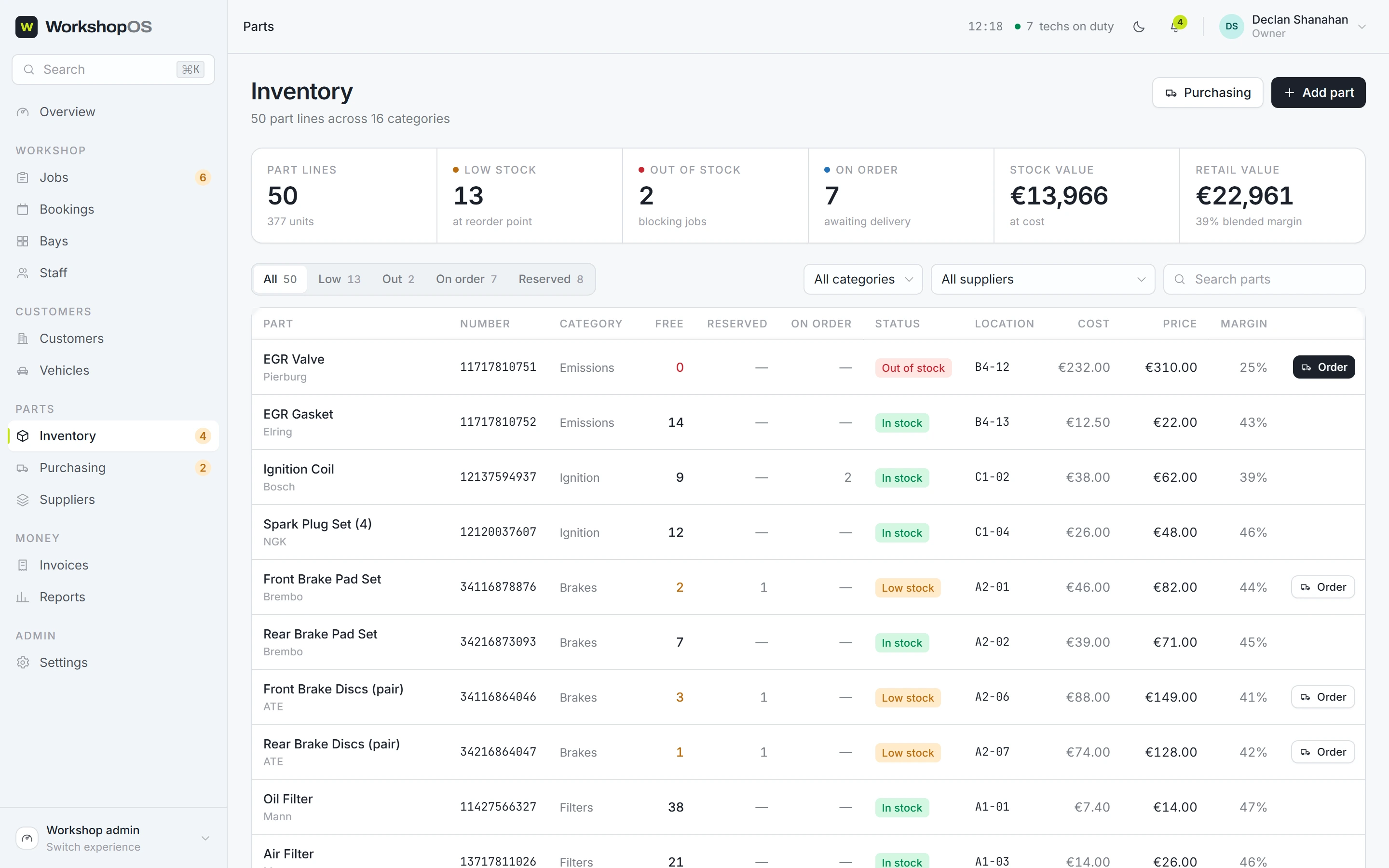
The shelf, as the system sees it
Stock gets reserved against the car that needs it, so a part cannot
quietly end up on the wrong vehicle. That is Owner 2's duplicate-order
problem, designed out instead of warned about.
What I deliberately cut
None of these are unfinished corners. I cut each one to protect the flow
that mattered most: diagnose it, repair it, get the parts, buy the parts,
finish the job, send the invoice.
Full accounting integrationIt writes the invoice. Replacing a shop's accounting software is a different product.
Live supplier APIsRealistic mock data instead. The design question was how you show someone three supplier options, not where the data comes from.
A standalone customer appA web page that works on a phone does the job. Customers want to see where the car is and tap approve. That does not justify asking them to install anything.
Advanced AI diagnosticsCut on purpose, so the promise stays honest.
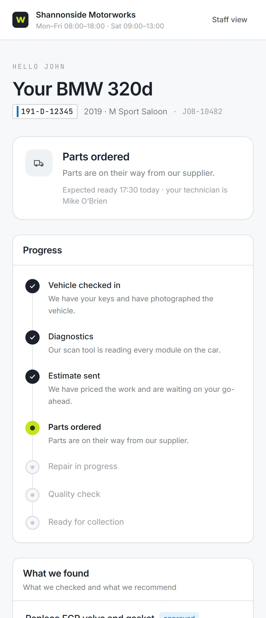
The responsive portal
Where the car is, what was found, what it costs including VAT, and a button to approve.
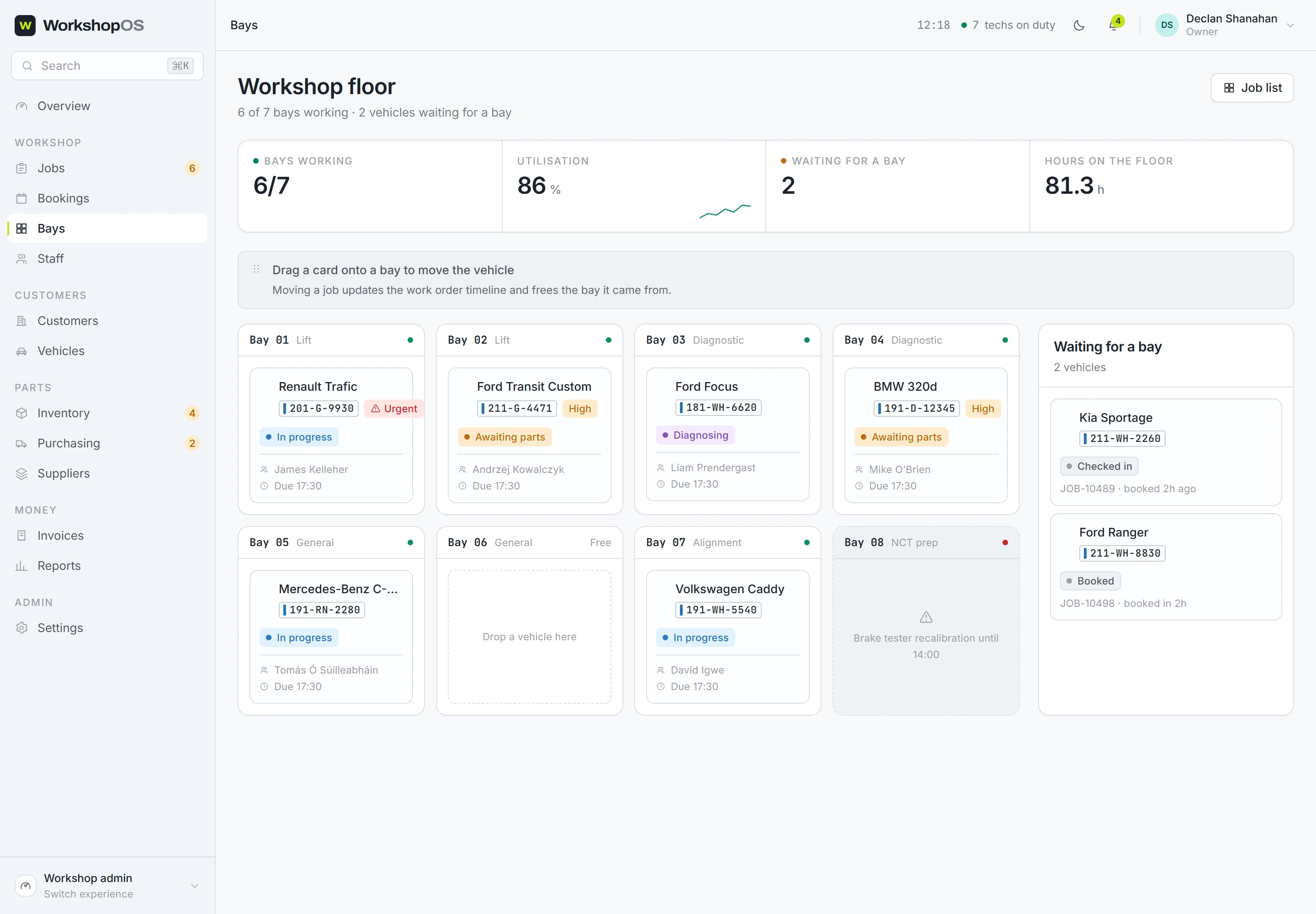
app.workshopos.io/bays
The floor
Managers describe their shop as bays, so the screen shows bays. Drag a waiting car onto a free one.
06 Projected impact
These are targets, not results.
Read this part carefully. I have not run a usability test, and this has
never run in a real garage. Every number below is a goal I designed towards.
Not one of them is something the product has achieved, and not one came off
anybody's shop floor. I have put the reasoning under each so you can
disagree with it.
The bet: this works if it cuts the number of times a job has to be handed
from one person to the next between diagnosis and payment.
Projected target5 → 1
Manual handoffs per job
Why
Owner 2 walked me through five hand-offs between finding a fault and
ordering the part. Wiring diagnosis straight into parts and purchasing
collapses those into one system. Whether it really lands at one is
exactly what a pilot would tell me.
Projected targetSame day
Time from diagnosis to parts ordered
Why
The parts request is generated from the diagnosis itself, so it stops
waiting on a person to turn one into the other. Plausible mechanism,
still an untested claim.
Projected target↓
"Awaiting parts" dwell time
Why
Stock levels and supplier delivery dates appear at the moment of
diagnosis, so the back-and-forth that stretches this state has nowhere
to happen. How much shorter, I would need real shop data to say.
Projected target↓
Information-sync errors
Why
Wrong parts, the same part ordered twice, a job status nobody has
updated. One job record that everyone reads from removes the
disagreeing-spreadsheet problem Owner 1 described.
Projected targetFaster
Invoice turnaround
Why
Parts and hours are already sitting on the job, so the invoice is built
from what is there instead of retyped. That should shorten the gap
between finishing a car and getting paid for it.
If this ever gets built for real, these five are what I would measure. Today
they are hypotheses with reasoning attached, and nothing more than that.
Validation plan · what's next
The next step is to sit down and watch someone use it.
I would take the prototype back to the same three owners. Not a demo. A
task:
A 2019 BMW arrives with an engine warning light. Diagnose it, identify the
repair, request the parts, and prepare the job for invoicing.
Then stop talking and watch. What people say about an interface and what
they do with one are two different things:
Where they hesitateAnd what information they expected to be there at that moment.
Do they call it what I call it?Their words for the work, not mine.
Does putting the job at the centre match how they think?That is the whole bet. This is the test of it.
Is the mechanic's screen actually faster?Timed against how they work today, not against a blank page.
Can a manager read the floor without asking anyone?Owner 1's problem, turned into a pass or a fail.
Where does it still force a phone call?Every call left over is a gap I have not closed.
Whatever comes back changes the structure, and probably some of my
better-looking screens.
workshopos.io/#features
Marketing · feature showcase
Every claim on the marketing site sits next to the screen that backs it
up, so the pitch and the product cannot drift apart.
The short version
I didn't start by designing a dashboard.
I started by asking three people how their shops actually run. The problem
turned out to be hand-offs, not software. Everything after that followed
from putting the job at the centre: diagnostics wired to parts, parts wired
to purchasing, and a different screen for each role sitting on the same
data.
That is WorkshopOS.
Central object Work OrderRoles 7 · 21 permissionsSurfaces Admin · Floor · Portal · MarketingStatus Interactive prototype
Go and poke at it. The sign-in page lists seven demo accounts, one click each,
with the password printed underneath. Sign in as the Owner and
you get the whole shop. Sign out, come back as a Technician, and
watch how much disappears. That is the permissions model, and it takes ten seconds
to see.