Following Ridwan from first install to daily habit, and the opportunity
hiding in each stage.
(01)
Onboarding
Optimistic
DoingDownloads the app, creates an account.
Thinking"Let's see if this app can actually save me time."
OpportunityEngaging onboarding tutorials and interactive setup guides.
(02)
Setup
Hopeful
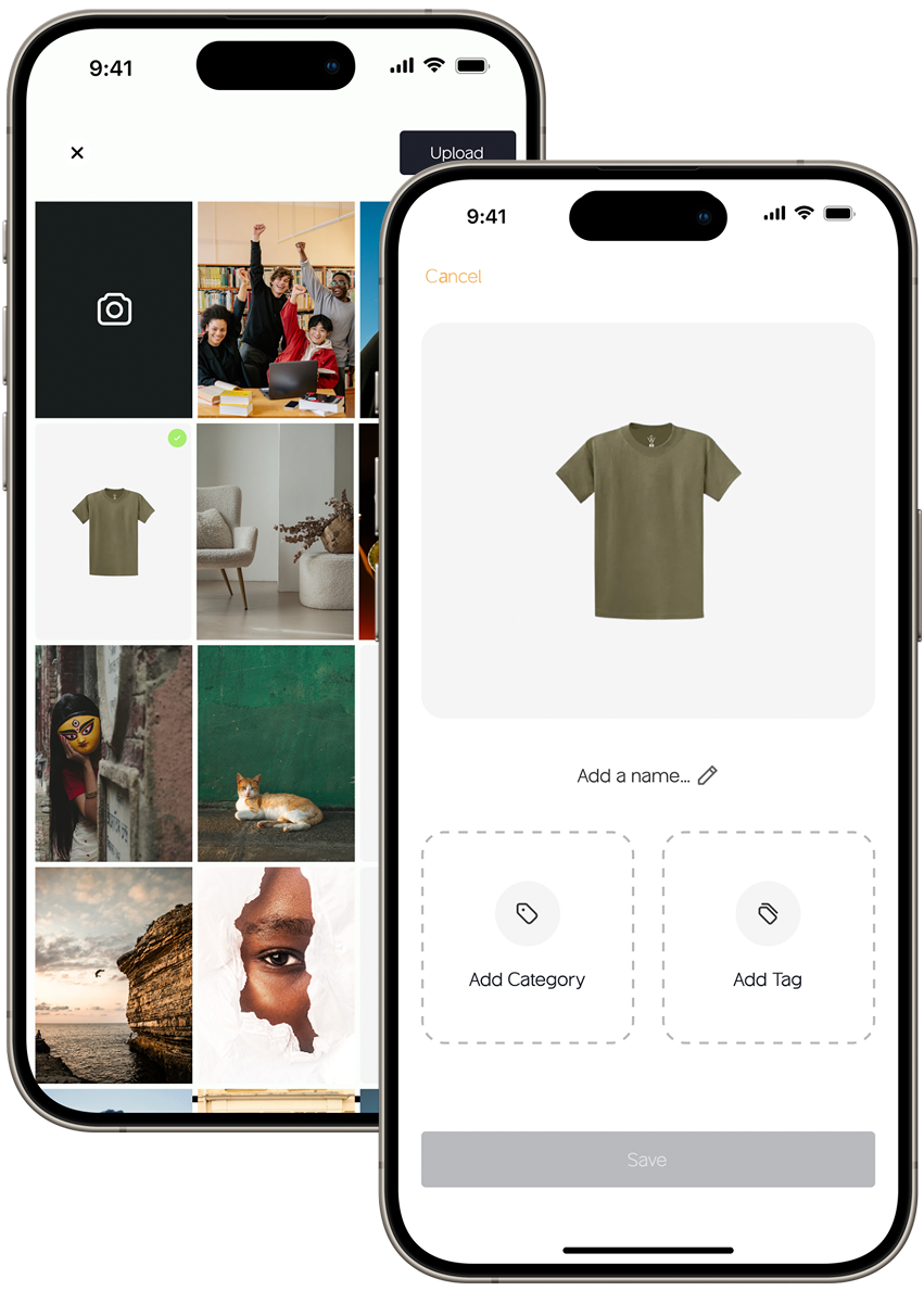
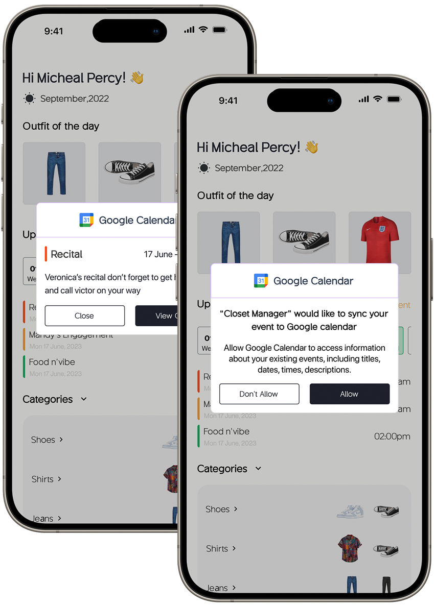
DoingInputs professional details, style preferences; syncs his calendar.
Thinking"I need to set my preferences properly to get relevant suggestions."
OpportunityAdvanced customisation and a guided tour of the features.
(03)
Daily use
Curious
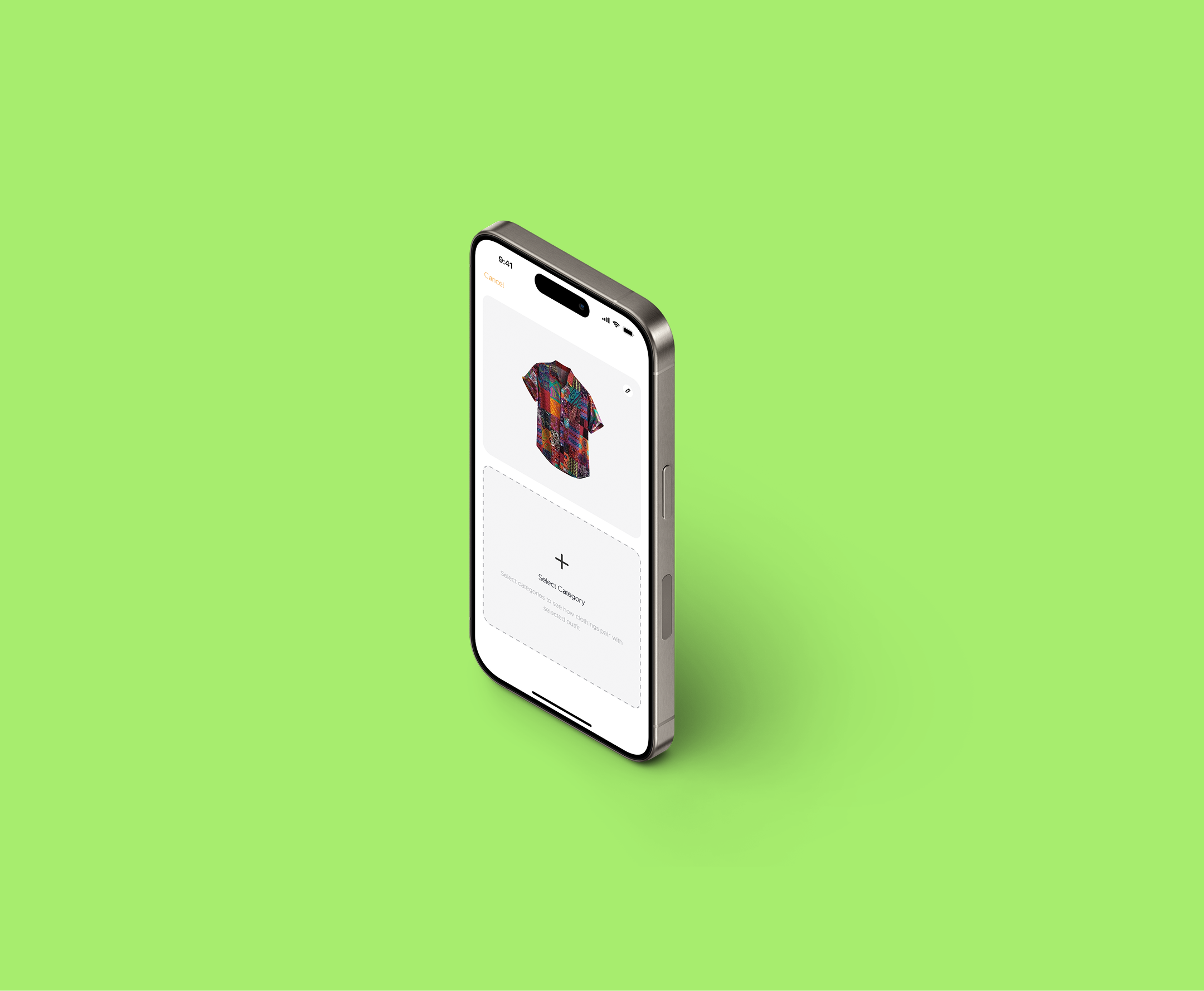
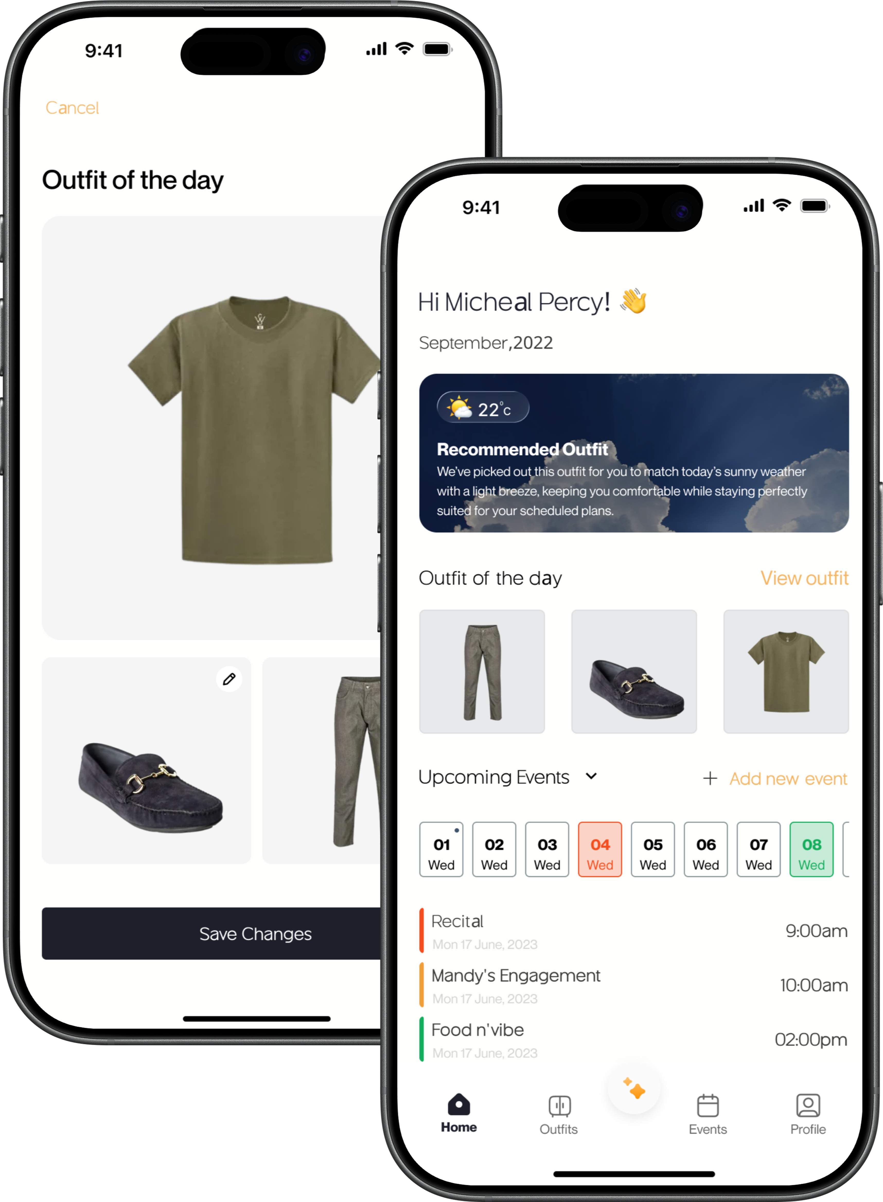
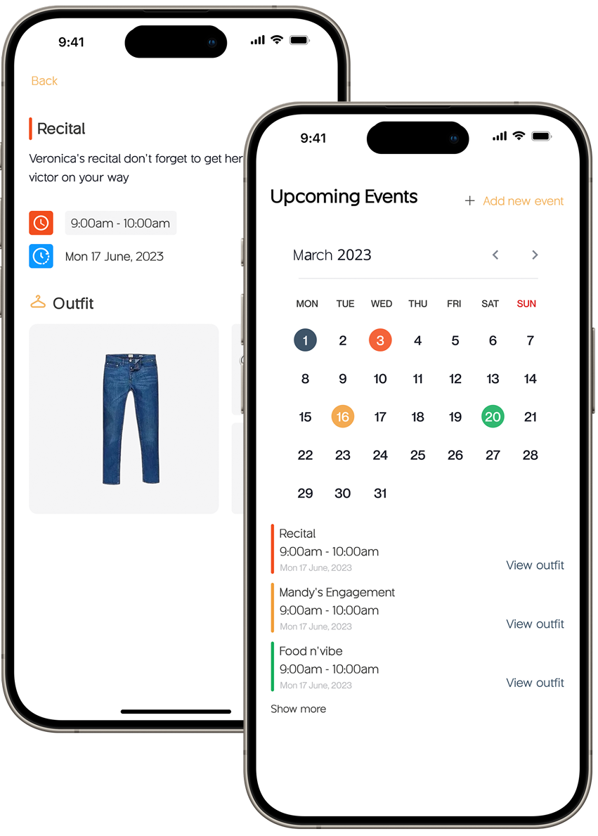
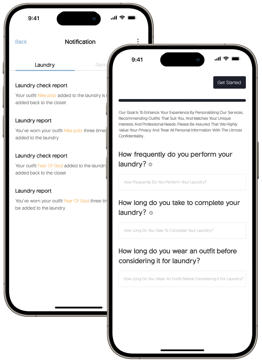
DoingReceives daily outfit suggestions; manages workwear and event looks.
Thinking"Good suggestions, but I'd prefer something more casual for today's meeting."
OpportunityIntuitive outfit editing; algorithms that learn individual style over time.
(04)
Engagement
Satisfied
DoingGives feedback on suggestions; refines his preferences.
Thinking"I use this regularly, but I'd love more variety."
OpportunityA community for sharing tips and outfit ideas; updates shaped by feedback.
(05)
Growth
Excited
DoingAdopts new features; recommends the app to others.
Thinking"This has genuinely simplified my mornings. I should recommend it."
OpportunityNew features that add value without adding complexity.